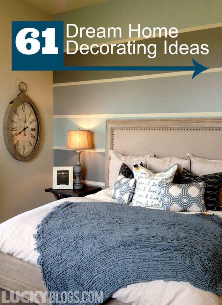
DREAM HOME IDEAS
Last June, a friend and I trekked from Spanish Fork to Lehi in search of over 20 Utah Valley Parade of Homes with the hopes of seeing new decorating ideas and wall treatments. Being Parade of Homes and Street of Dreams fans, we knew it’d take more than a day to get to them all, so take it from us and plan accordingly. Although neither of us are in the market to move, we’re always up for ideas we want to implement into our dream home (or make the one we have dreamy)!
WHAT WE LIKED AND WHAT WE DIDN’T
We liked the pebble ice machine in the Provo house as well as the decor professionally designed by Caitlin Creer and Alice Lane Home. My dream home would be designed by them, for sure! The way they combined textures, colors, and styles looked effortless. That’s not to say I could accomplish an effortless look, but a compliment to the way it all flowed together seamlessly, instead of looking forced.
Thankfully there were a lot more original works of art displayed in the homes this year. Having original artwork will set your home apart from everyone else’s. Expensive art is fun to have, but it doesn’t need to be pricey. Make your own or matt and frame a painting from a child. Second-hand stores have varying styles to choose from. The weirder the better in my book!
Along our way we stopped counting how many giant chess boards and pieces were on display. The first was fun but by the fifth and sixth we almost shoved them under a bed or into a closet. One of the houses that we couldn’t stand (the laundry room will forever be etched into my brain; brown carpet, black & white checkered floor, cream & green wallpaper, with multi-colored swirly framed print) won an award by their peers. After I heard that, I decided the voting must be rigged.
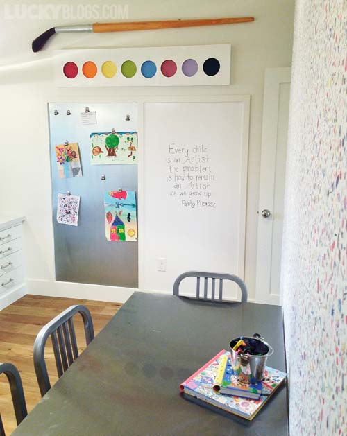 An entire room dedicated to crafting and artwork!
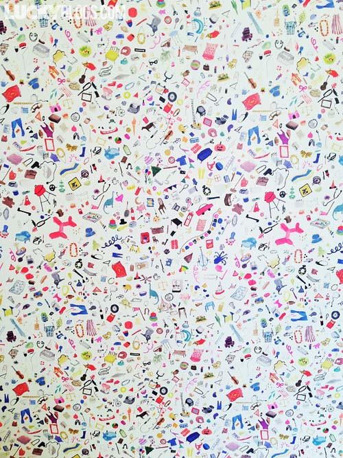 Detail of the art room I-Spy wallpaper.
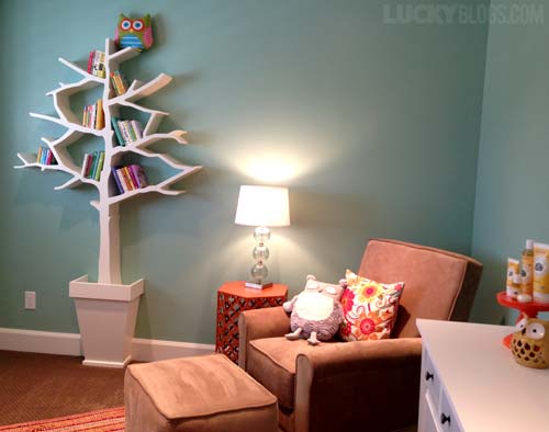 The tree bookshelf is cute but adding the owl to the top makes it fabulous!
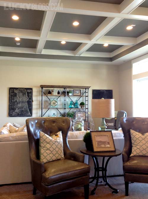 Coffered ceiling with the gray inset is delicious.
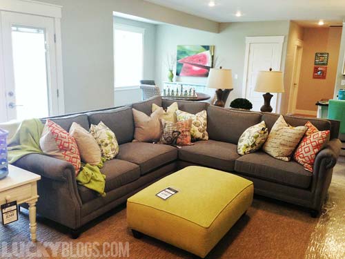 See the giant chess set in the back? That was the first. The watermelon painting!
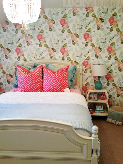 We audibly gasped rounding the corner to this wallpaper.
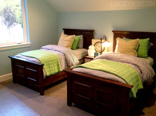 Shared bedroom for boys in muted tones with punch of lime.
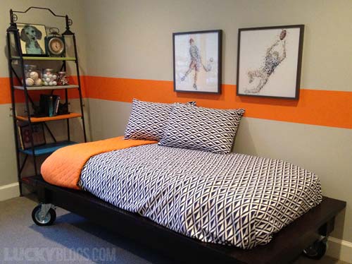 This room is also shared between two brothers. The orange stripe around the middle!
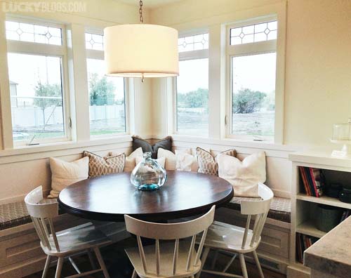 Built-in breakfast nook bench with beautiful drum pendant. Ah!
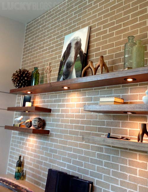 Check out the under lighting on these floating office shelves.
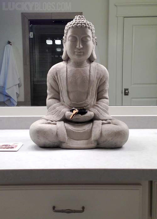 This 2′ tall Buddha will keep your keys safe.
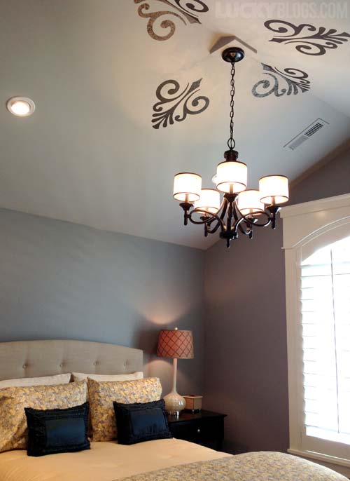 Not sold on the stencil but appreciated the idea of it.
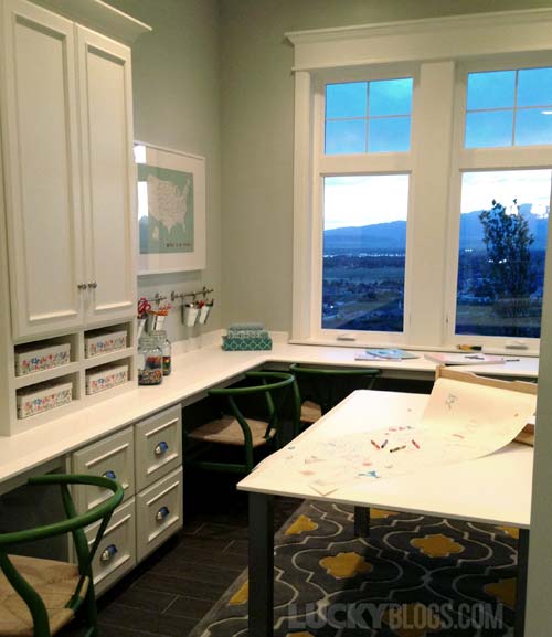 There were several dedicated art rooms this year. Mostly next to the kitchen.
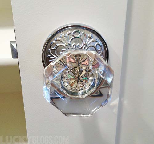 Attention to detail. This homeowner scoured the earth for just the right hardware.
She also had the builder hang three different hall pendants before she settled on the one she wanted.
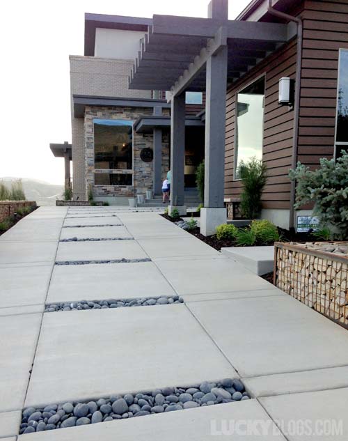 I’d grout/seal the rocks in place to avoid junk like leaves, dirt, etc. getting stuck in there instead of keeping them loose.
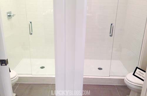 In a home with five boys, this mom decided to install two separate shower/toilet rooms inside the one shared bathroom instead of having more bathrooms to clean.
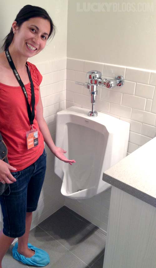 And in the other part of the boys dual shower bathroom is a urinal for a total of three potty places in one bathroom!
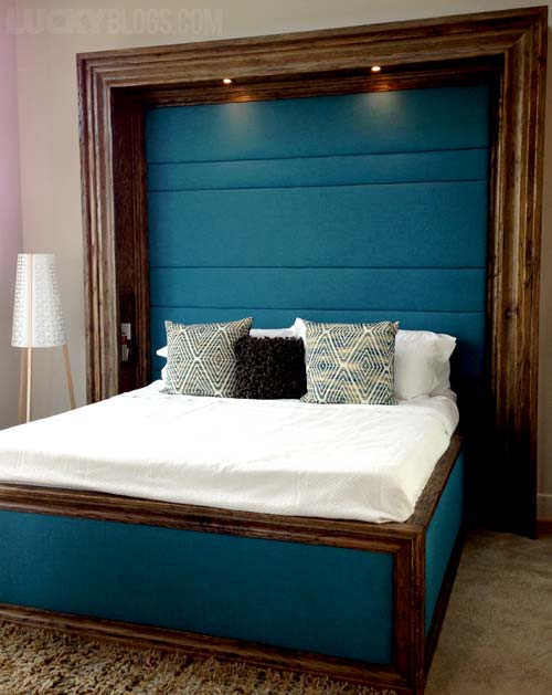 If you have a huge chunk of wood, you could craft your own giant headboard (shelves along the inside).
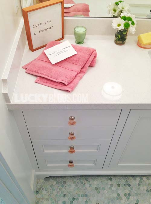 A subtle addition of pink crystal knobs and hand towel makes this bathroom.
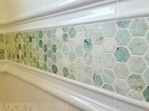 They continued the hexagon marble floor tile as a border in the shower.
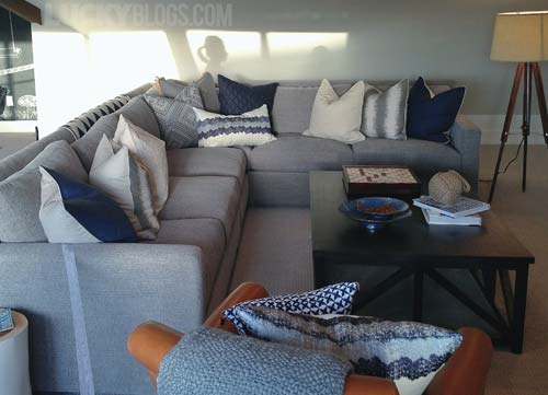 Lots of pillows this year. Very well put together with a fun karate chop top.
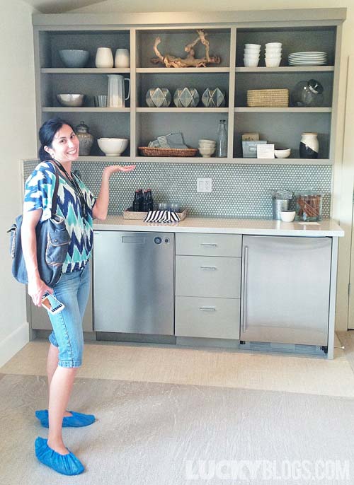 A built-in bar in the bonus room is perfect for movie drinks and snacks.
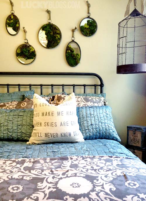 Are you kidding me with these moss-covered mirrors?!? No, you are not. Organic.
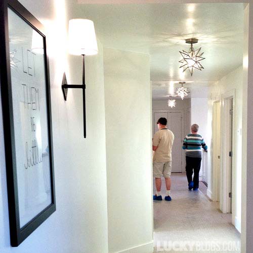 Unique lighting fixtures can bring a boring hallway up to the level of the rest of the house.
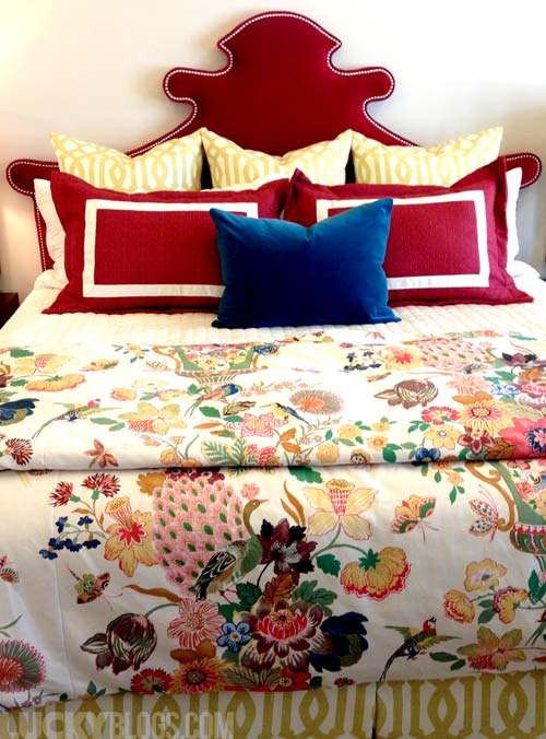 We couldn’t find the tag for this bedding. I wanted to steal it all!
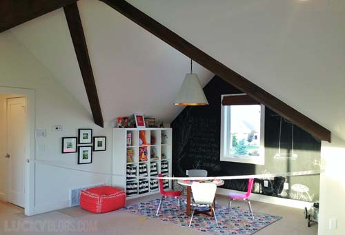 Lots of nooks for children to play and create.
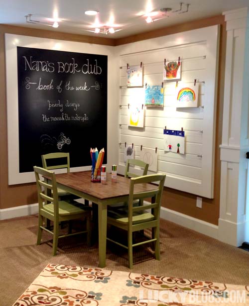 Nana’s Book Club book of the week and a place to display grandchildren’s art!
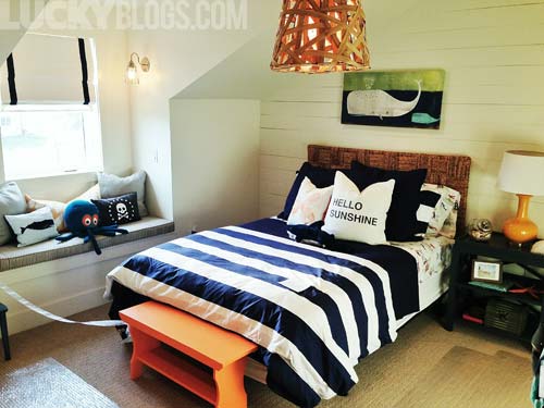 One of my favorite rooms! The decor is so fresh and the white wood paneling wall adds texture.
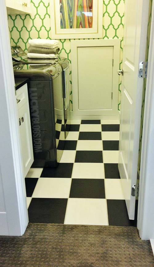 This is the weird laundry I was baffled by. The colors are so strange to me!
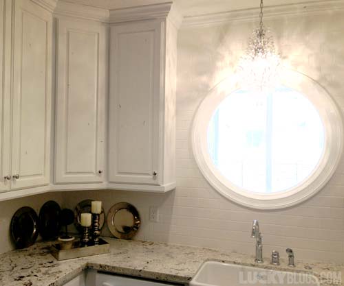 We need more round windows in this world. And chandeliers. More of those, too.
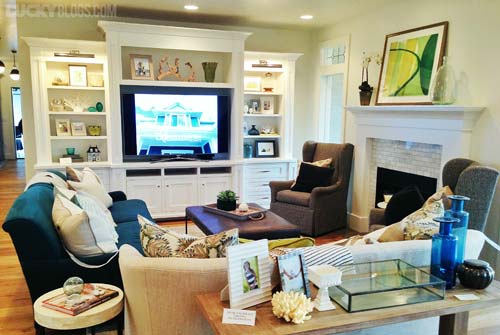 This room taught me you don’t have to have matching couches for it to look good.
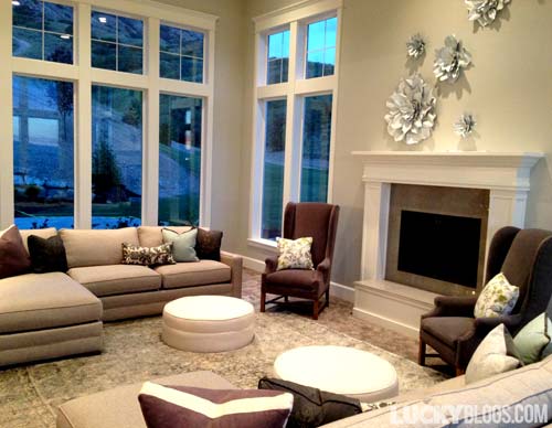 The incredibly high ceilings in this room made for amazing views all around.
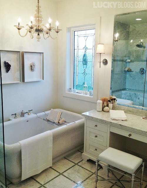 More chandeliers and stained glass, please. That tub is to die for!
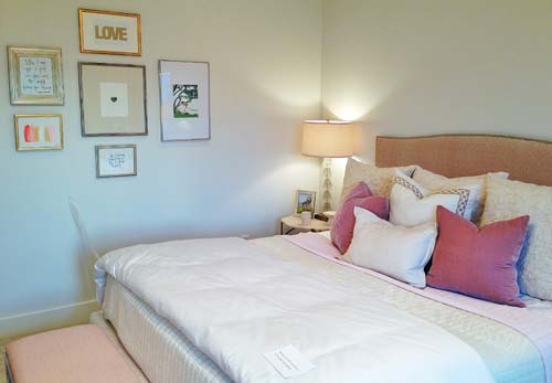 The mellow tones with splash of gold feels cozy in this master bedroom.
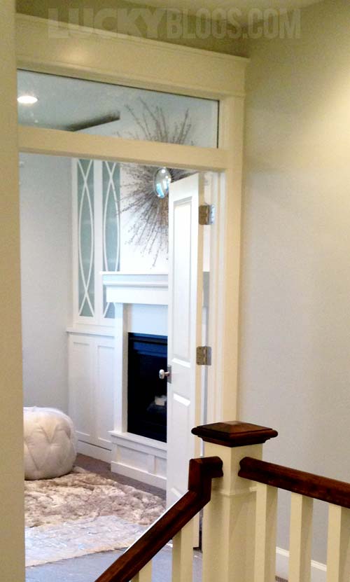 A view into the master suite hides the bed from view. Love the shelf door design.
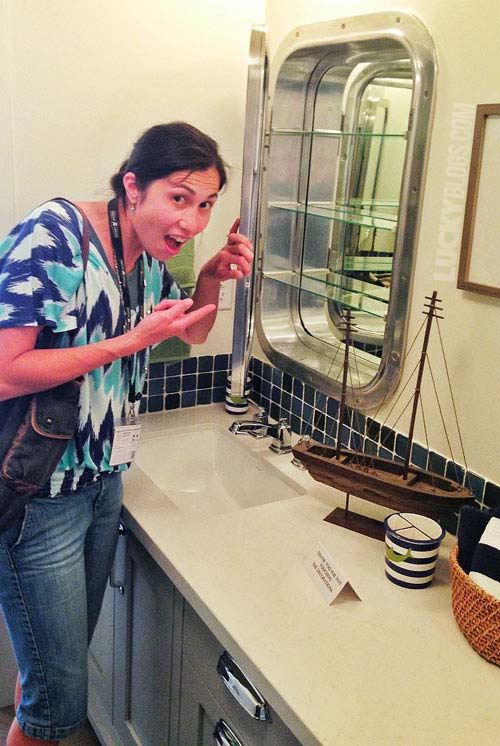 The sailor themed bathroom had the most gorgeous portal medicine cabinet.
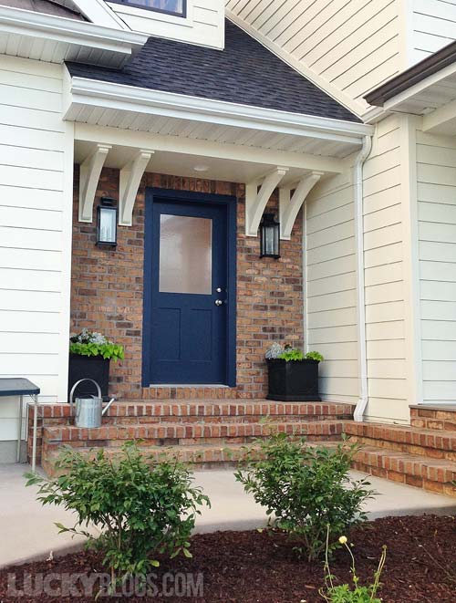 A side entrance to the mud room looks pretty enough to be the main entrance!
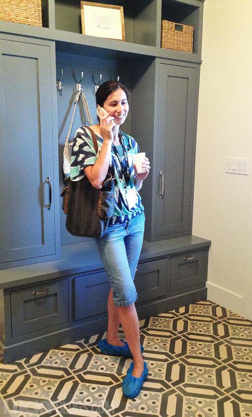 Taking an important call in the mud room. I should have drawers on bottom like these.
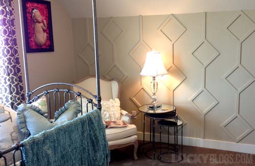 Whomever had the patience to measure and place the wall treatment is my hero… whomever they are.
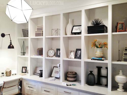 My open shelving doesn’t look like a magazine spread. This inspires me to change that.
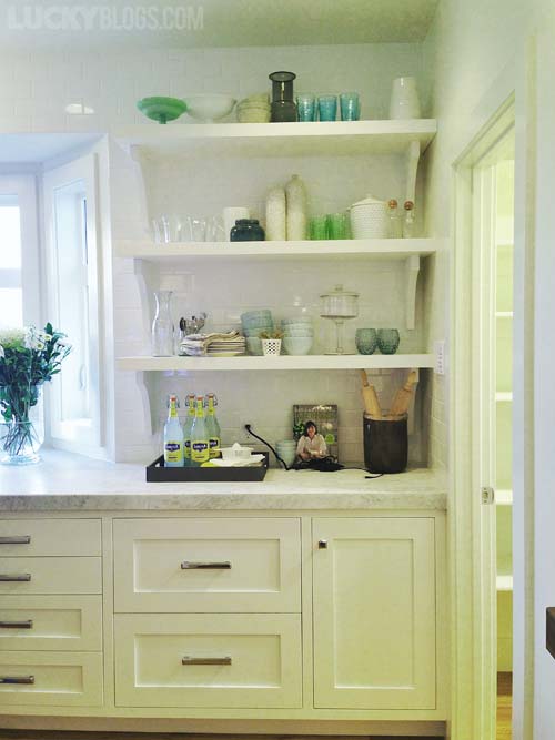 Open shelving in the kitchen can work, especially with gorgeous dishes and glassware!
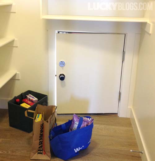 The garage is a few steps down, so they installed a little door so they can unload the groceries from the car to the pantry much faster without dragging it all through the house.
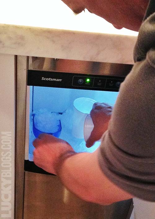 Matthew McConaughey has a pebble ice machine in his kitchen, so I want one, too. Maybe he’ll come visit me when I have one?
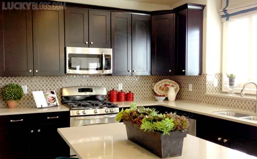 What a pretty quatrefoil backsplash.
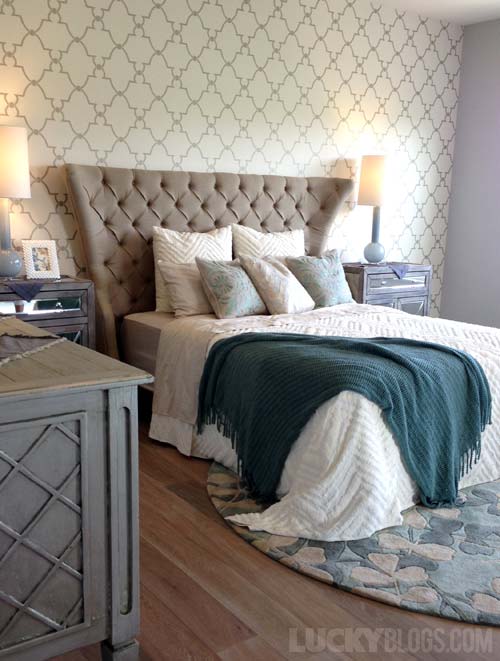 This room was my second favorite. The distressed furniture and colors impressed me. And “HELLO” fancy wallpaper!
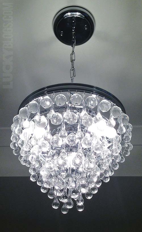 Raindrop chandelier in a master closet. Yes, a closet!
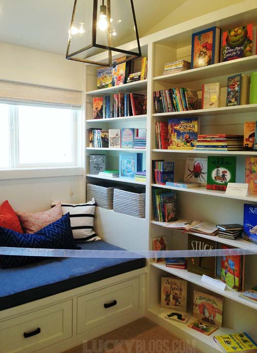 Yet another reading area but this time with a built in bench.
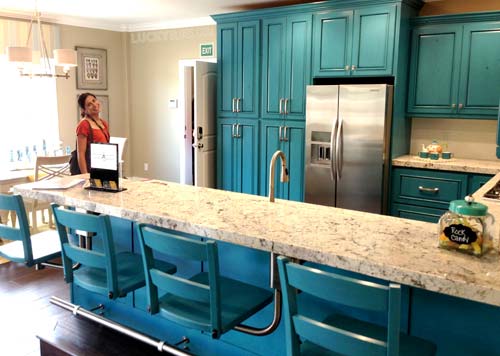 Another stupid chess board in the back. But, hey, turquoise kitchen with legless barstools.
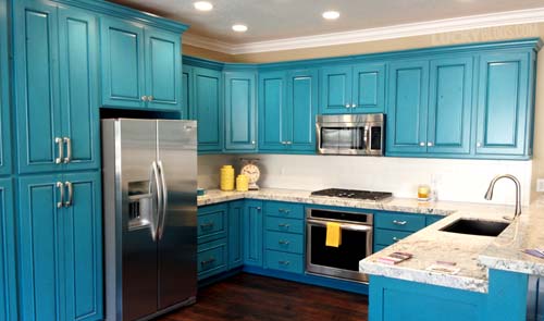 The light streaming into this kitchen brings the cabinets to life!
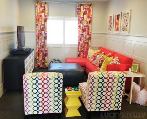 This room was right next to the laundry room I didn’t like. I wasn’t a fan of this room either. I think they squished too many things into the small space, but I appreciate the attempt at adding color (although they clashed; you might not be able to tell in the photo but in person it was wonky).
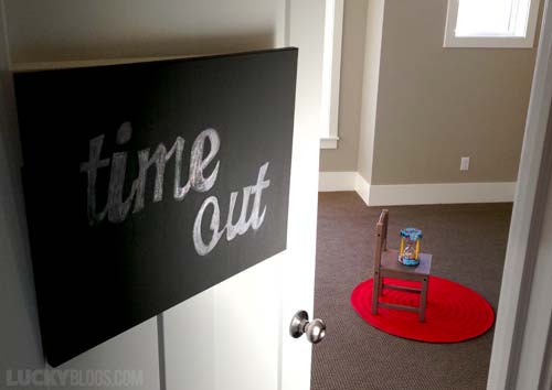 Clever way to decorate a room when you’ve run out of money.
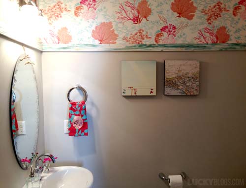 Coral and turquoise are big these days, and this bathroom proves how perfect they are for each other!
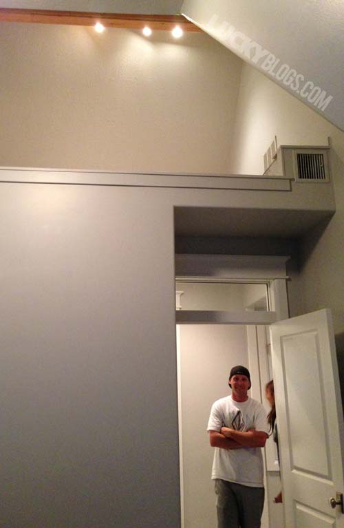 Take out a wall and you’ve got a fun play space up in the ceiling. The mom will wait until her littlest is old enough to maneuver a ladder before they install one.
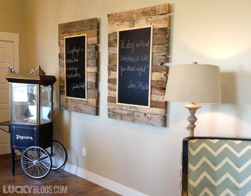 Reclaimed wood as a background for chalkboard art. Like that there are two.
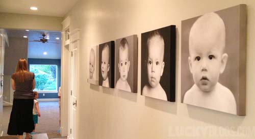 Wish I would’ve thought to photograph my children the same way at the same age. Her wall of five is much more impressive than only having two.
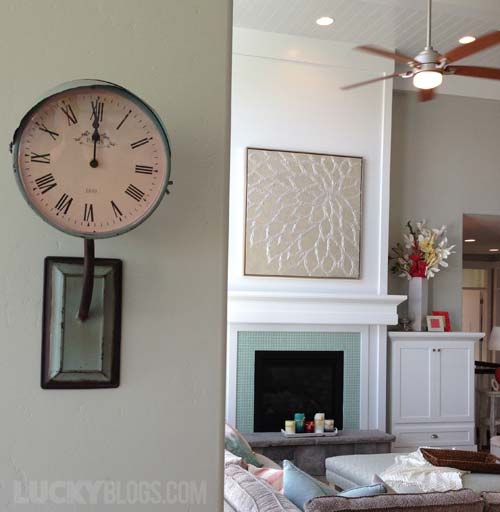 Wonder if this clock came from Restoration Hardware (looks like their style).
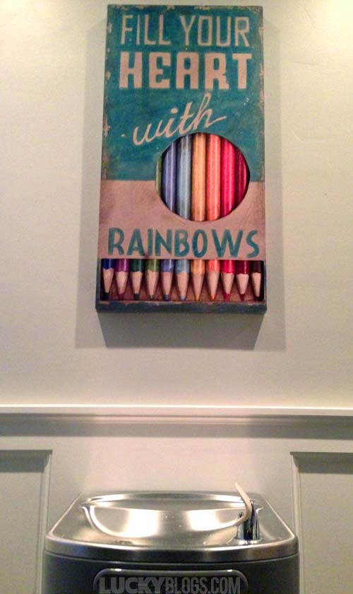 Thirsty kids deserve a fountain in the hallway by the back door.
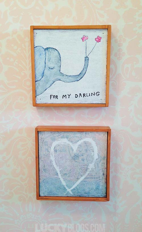 See how fun original artwork can be, especially on gorgeous wallpaper?!?
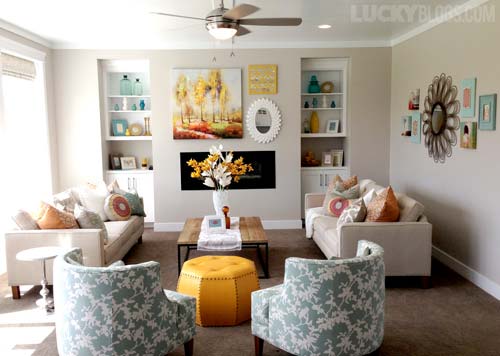 One of my other most favorite rooms. Love the colors, textures and varying shapes.
I hope you enjoyed seeing photos of my dream home ideas. I’m sure I won’t ever implement all of what I saw, but having the pictures to look back on will be easier when I design my next room makeover.

